
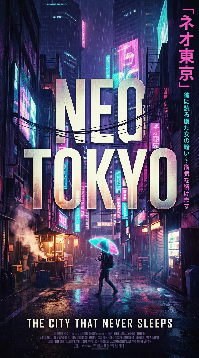
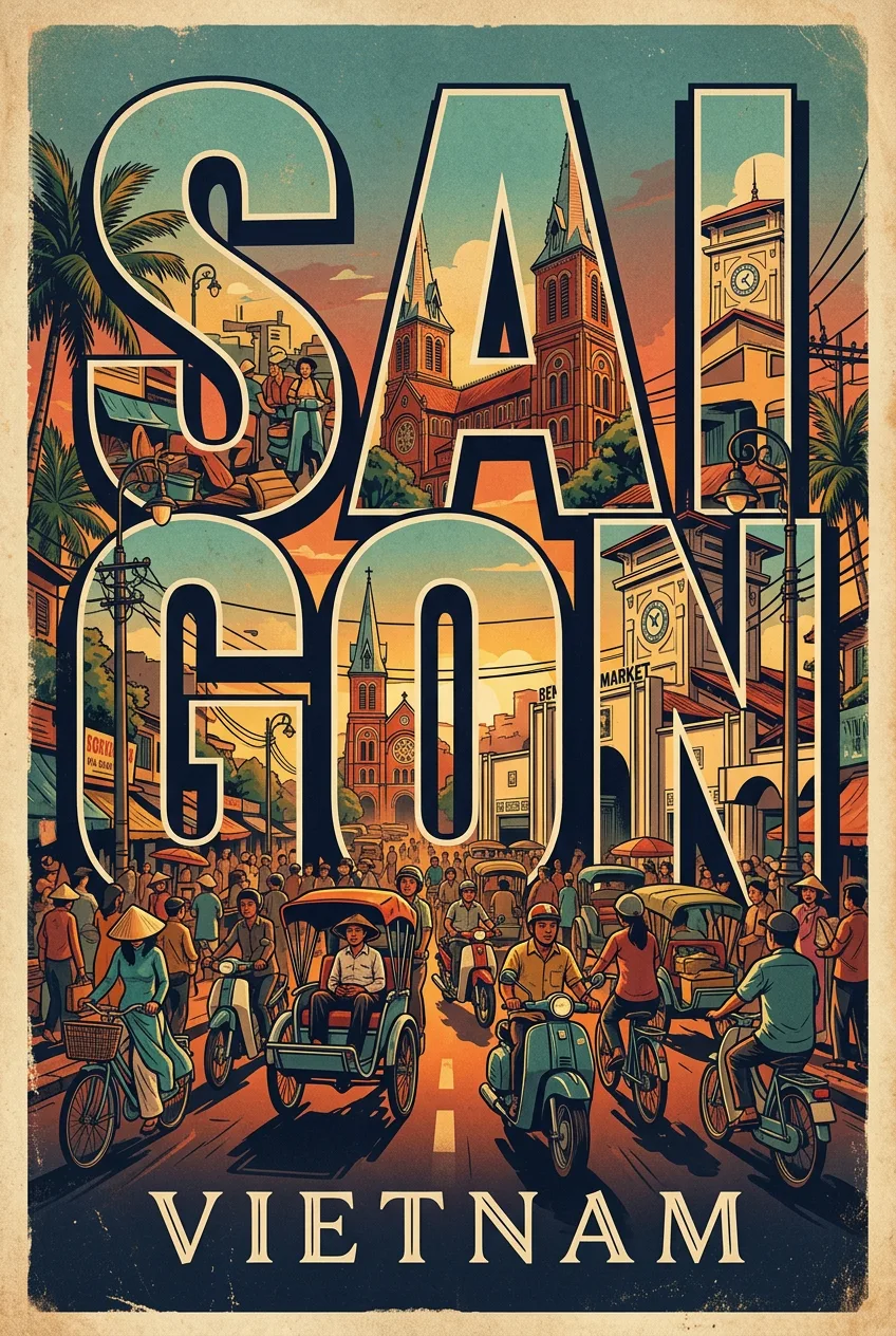
1960s Cola Advertising Poster
프롬프트
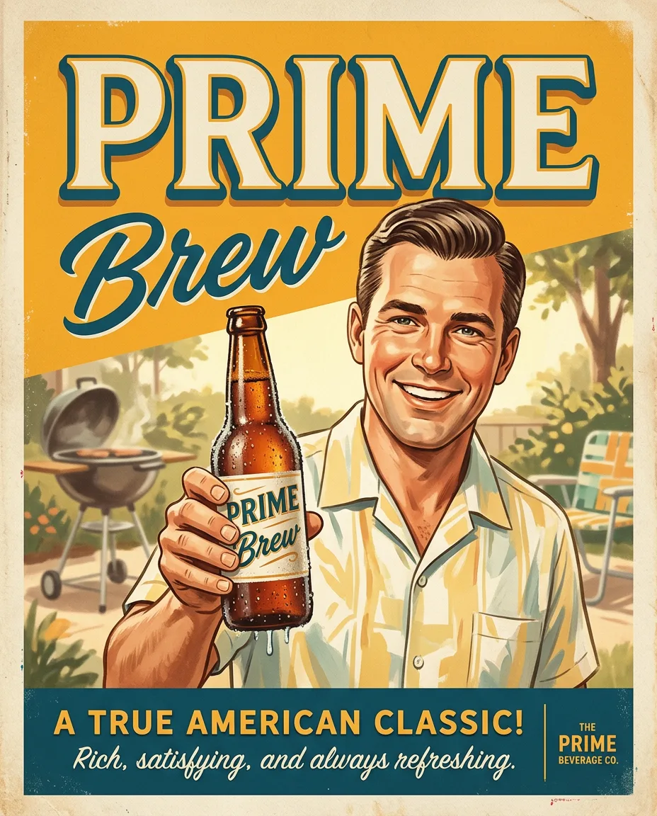
Authentic 1960s American advertising poster for Prime, vintage mid-century commercial illustration, PERSON DESCRIPTION holding a frosty glass bottle of BREW, bright optimistic lifestyle scene, nostalgic Americana atmosphere, bold COLOR 1 and COLOR 2 color palette, elegant retro typography, the text “BREW” prominently integrated into the poster design, authentic screen print texture, subtle paper grain, hand-painted illustration style, vintage Madison Avenue advertising aesthetic, clean composition, highly detailed, warm cinematic lighting, premium poster design, authentic 1960s print imperfections, painterly realism, soft brushwork, vertical composition 4:5 The poster is designed to stop a scroll: Authentic 1960s American advertising poster for Prime, vintage mid-century commercial illustration, PERSON. One bold central image, a clear hierarchy of title and details, and a palette chosen for instant recognition from across a room. Composition is a classic poster grid: the hero image fills the upper two-thirds, the title sits in strong, legible type, and the lower third carries a few short lines of supporting text and no clutter. Margins are generous and deliberate. Lighting is dramatic and cinematic: strong directional light with deep shadows, glowing highlights, and a color grade that matches the poster's mood — warm gold for adventure, cool blue for mystery, red for tension. Materials are print-like: subtle paper grain, screen-printed texture, and rich, slightly muted inks. The mood is bold and collectible, the kind of poster a fan pins above a desk for years. The final poster is finished to a professional standard: a clear hierarchy, legible type, balanced composition, and a consistent visual voice from corner to corner. It reads instantly from across a room and rewards a closer look. Every detail is checked for believability: the title is short and readable, the supporting text is minimal, the colors stay in harmony, and nothing crowds the edges. The result is a poster worth pinning up and keeping.
프롬프트 상세
| 최적 모델 | Nano Banana 2.1 |
| 화면 비율 | 4:5 |
| 상업적 이용 | 가능 — 결과물 라이선스는 사용하는 모델의 약관을 따릅니다 |
이 프롬프트가 효과적인 이유
Subject: Authentic 1960s American advertising poster for Prime, vintage mid-century commercial illustration, PERSON, rendered with specific, countable detail rather than generic labels. Composition: classic poster grid with the hero image dominant, clear title hierarchy, and generous margins. Lighting: dramatic directional light with deep shadows and glowing highlights.
프롬프트 사용법
- 프롬프트 복사
- 위에 표시된 모델 열기
- 생성하기
출처: PixAttic Studio(오리지널 항목). 수집 항목은 항상 원저작자를 여기에 표기하고 원본 게시물로 링크합니다. DMCA · 신고 또는 삭제 요청
Prompt adapted and expanded from @RizwanAly07 · via PicGens. All images on this page were generated by PixAttic Studio using the prompt above.