Blush Placement by Face Shape
프롬프트
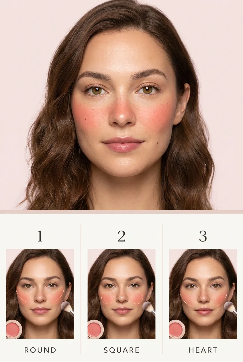
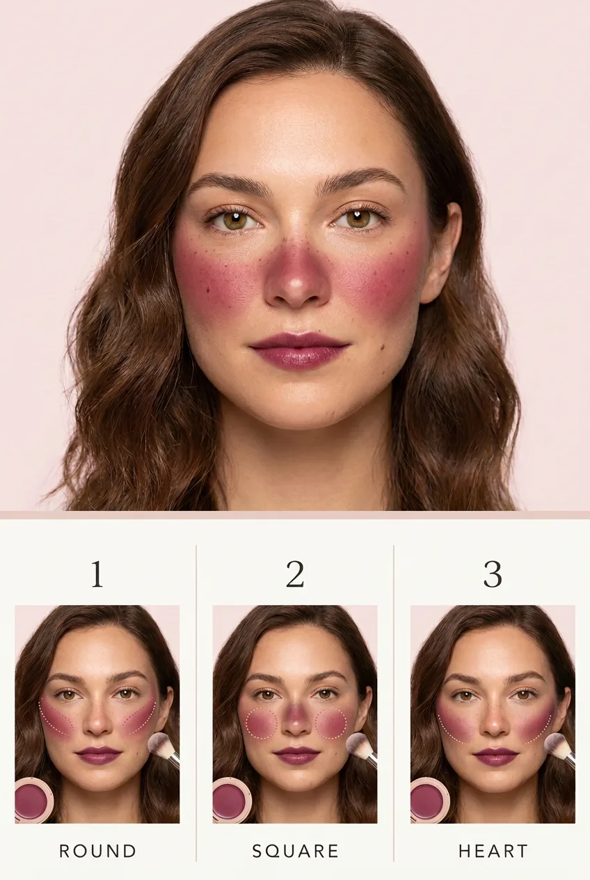
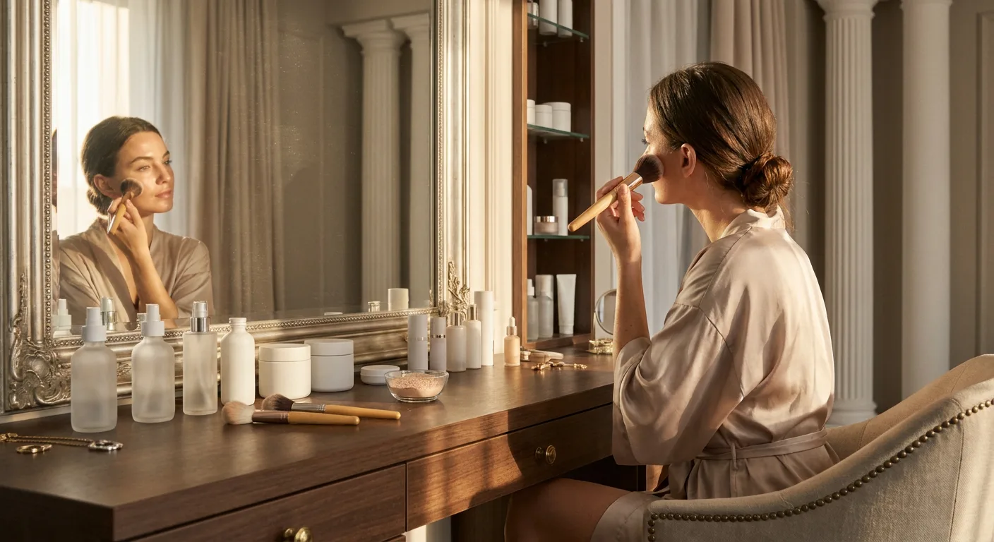
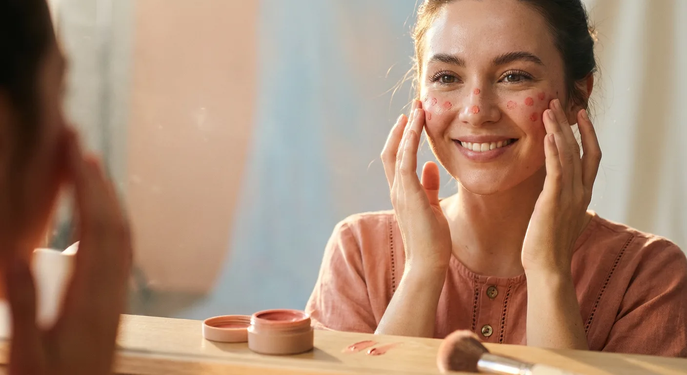
A clean beauty tutorial guide chart in a vertical infographic layout on a soft rose-quartz pastel background with generous white space. The upper portion of the frame holds one large beauty portrait showing a softly flushed finished look, and the lower portion holds a neat horizontal row of three medium rectangular panels separated by thin pale divider lines, each panel a smaller front-facing portrait of the same woman with blush placed differently and simple soft dotted guide arcs on the cheeks showing each placement zone. The model throughout is a clearly adult woman in her late twenties with light-medium warm skin, natural texture with a few moles, shoulder-length chestnut hair with a soft wave, and hazel eyes. In the main portrait her finished look is a fresh sun-kissed flush: coral-pink cream blush swept across the apples of the cheeks and lightly over the nose bridge, paired with tinted moisturizer, groomed brows, and a rosewood lip tint. The first mini panel shows round-face placement, blush swept back and upward toward the temples to add length. The second shows square-face placement, color concentrated softly on the apples to soften angles. The third shows heart-face placement, blush angled along the cheekbones toward the ears to balance a narrower chin. In each panel the blush zone is softly highlighted so the difference reads at a glance. All products are generic and unbranded compacts with no logos. Text stays minimal: the numbers 1 2 3 above the three panels and the short labels ROUND, SQUARE, HEART spelled exactly beneath them; no other words anywhere. Soft diffused beauty-studio lighting, clean and bright, flatters the skin while keeping the guide arcs visible. Style anchor: professional beauty editorial infographic, an instructive magazine tutorial page with tidy alignment. Sharp focus, true-to-life color, fine skin detail, premium finish.
프롬프트 상세
| 최적 모델 | Nano Banana Pro |
| 화면 비율 | 4:5 |
| 상업적 이용 | 가능 — 결과물 라이선스는 사용하는 모델의 약관을 따릅니다 |
이 프롬프트가 효과적인 이유
Subject: A vertical comparison chart showing three blush placements for round, square, and heart face shapes on one adult woman with chestnut hair. Composition: Large softly flushed finished portrait above three medium mini-portrait panels, each with dotted guide arcs marking the blush zone. Camera: Front-facing beauty framing, consistent across all four portraits. Lighting: Soft diffused studio light, clean and bright, keeping guide arcs visible. Material: Coral-pink cream blush in a plain unbranded compact. Style: Professional beauty editorial infographic, instructive magazine tutorial page. Guards: Numbers and three shape labels only, no logos, placements clearly distinct per panel.
프롬프트 사용법
- 프롬프트 복사
- 위에 표시된 모델 열기
- 생성하기
출처: PixAttic Studio(오리지널 항목). 수집 항목은 항상 원저작자를 여기에 표기하고 원본 게시물로 링크합니다. DMCA · 신고 또는 삭제 요청
Original prompt and images by PixAttic Studio.