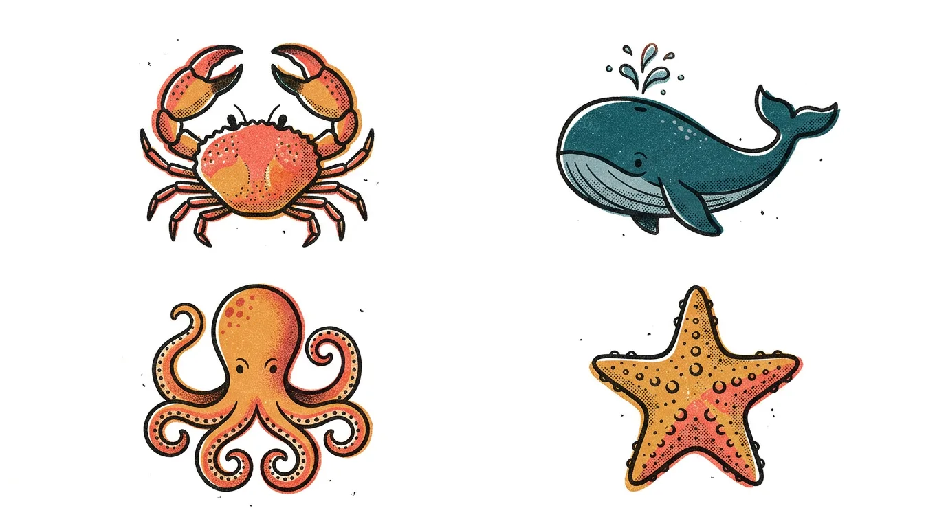
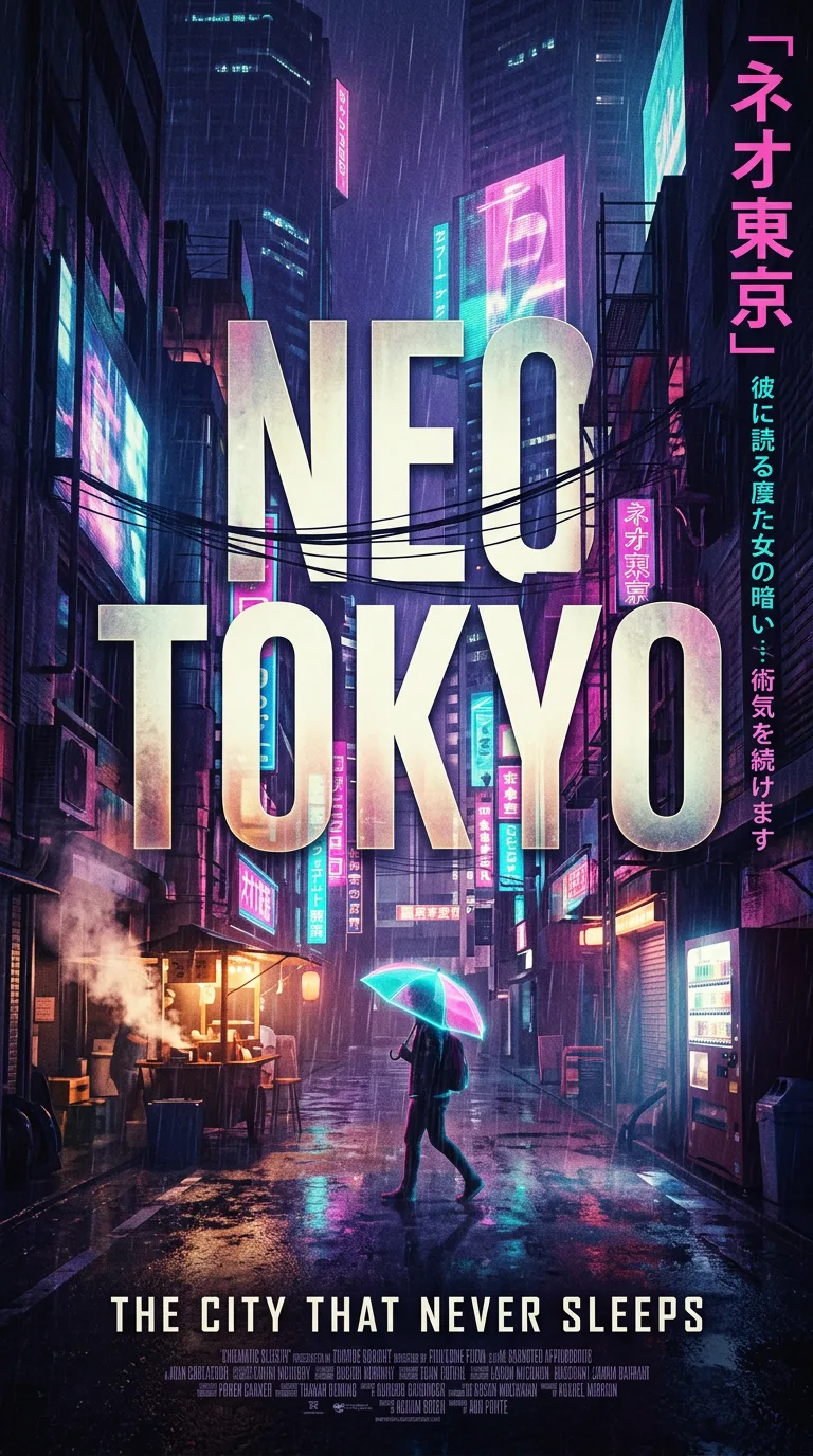
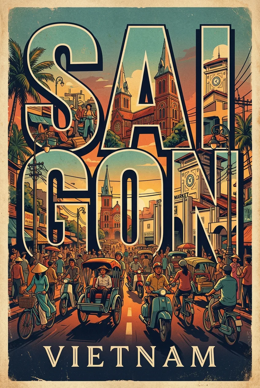
Ocean Life Icon Collection
프롬프트
Create a collection of icons representing ocean life, they belong together as a single theme. Put them in a 2x2 grid (no lines). The background is pure white. Make the icons as risograph prints. No text. No color distortion. Vibrant and not faded. Stochastic stippling and sand-like noise pattern within color fills. Each icon has a thick black outline. The design is a vintage-inflected graphic: Create a collection of icons representing ocean life, they belong together as. Simplified shapes, limited palette, and confident typography carry the whole message, with texture and grain doing the work that detail would do in a photograph. The layout is balanced and unhurried: a strong central motif, generous negative space, and type placed with intent — a headline that can be read at a glance and small details that reward a closer look. Color is the lighting here: a restrained, era-true palette with one accent that pops, soft tonal transitions, and a warm, slightly faded finish that feels printed and aged rather than digital. The finish is tactile: risograph grain, offset misregistration, paper fiber, and hand-drawn imperfection. The mood is nostalgic and charming, a poster that feels found in a flea market and kept forever. Every detail is checked for believability: the title is short and readable, the supporting text is minimal, the colors stay in harmony, and nothing crowds the edges. The result is a poster worth pinning up and keeping. The final poster is finished to a professional standard: a clear hierarchy, legible type, balanced composition, and a consistent visual voice from corner to corner. It reads instantly from across a room and rewards a closer look. The craft is in the details: every edge is considered, every color is chosen on purpose, every shadow falls where real light would put it, and every texture — skin, fabric, paper, metal, foliage — is rendered with the patience of a maker who cares about the small things. The image is composed to be looked at twice: once for the first impression, and again for the details that reward a slower eye, the quiet jokes and careful choices hiding in plain sight.
프롬프트 상세
| 최적 모델 | Nano Banana 2.1 |
| 화면 비율 | 3:4 |
| 상업적 이용 | 가능 — 결과물 라이선스는 사용하는 모델의 약관을 따릅니다 |
이 프롬프트가 효과적인 이유
Subject: Create a collection of icons representing ocean life, they belong together as, rendered with specific, countable detail rather than generic labels. Composition: classic poster grid with the hero image dominant, clear title hierarchy, and generous margins. Lighting: dramatic directional light with deep shadows and glowing highlights.
프롬프트 사용법
- 프롬프트 복사
- 위에 표시된 모델 열기
- 생성하기
출처: PixAttic Studio(오리지널 항목). 수집 항목은 항상 원저작자를 여기에 표기하고 원본 게시물로 링크합니다. DMCA · 신고 또는 삭제 요청
Prompt adapted and expanded from @NanoBanana · via PicGens. All images on this page were generated by PixAttic Studio using the prompt above.