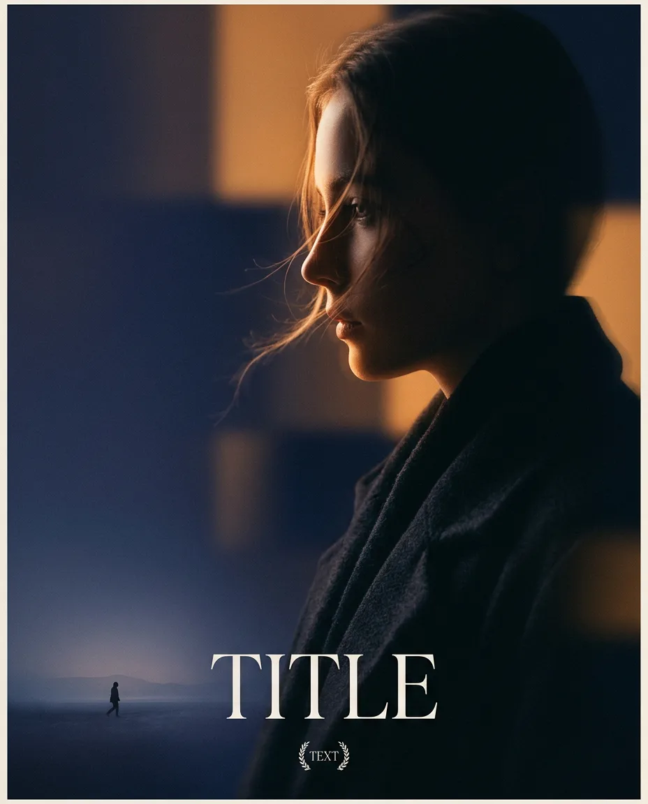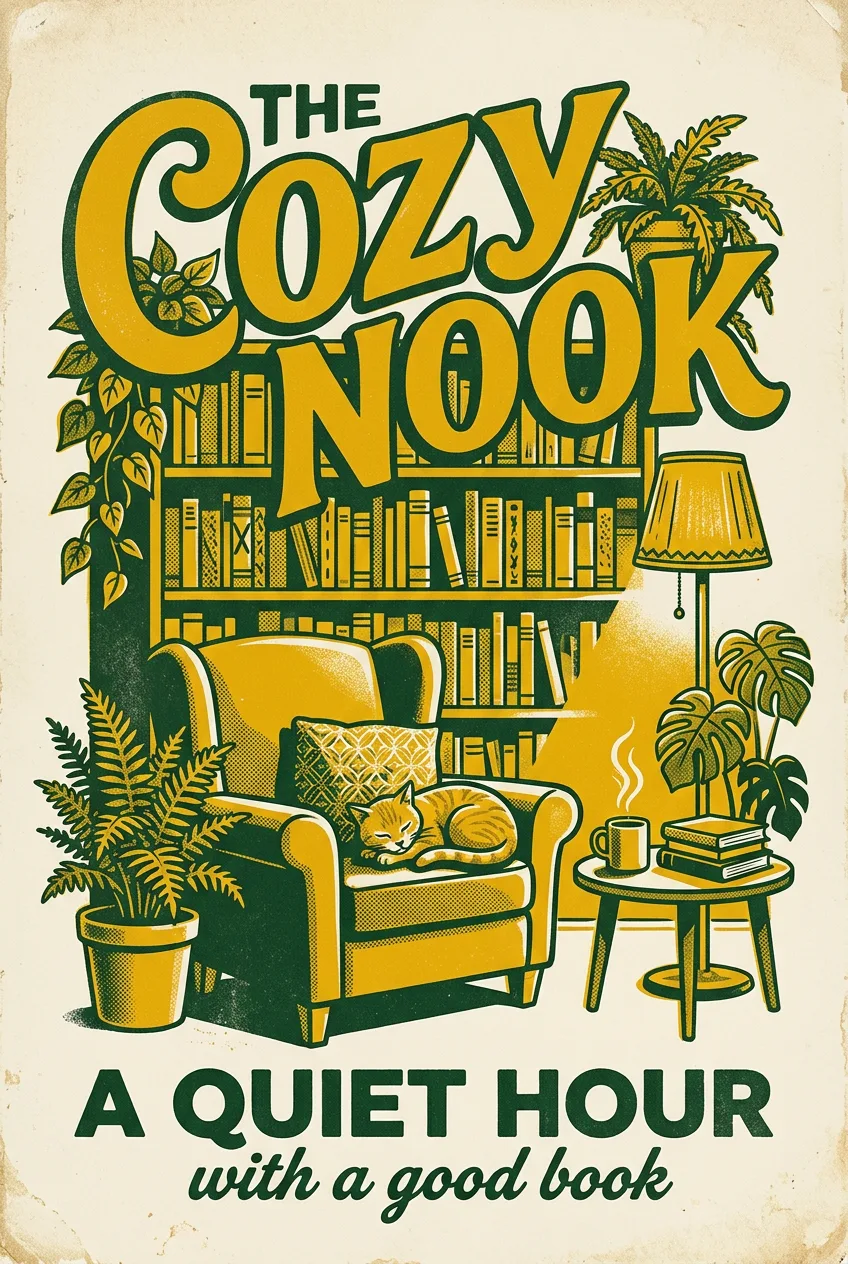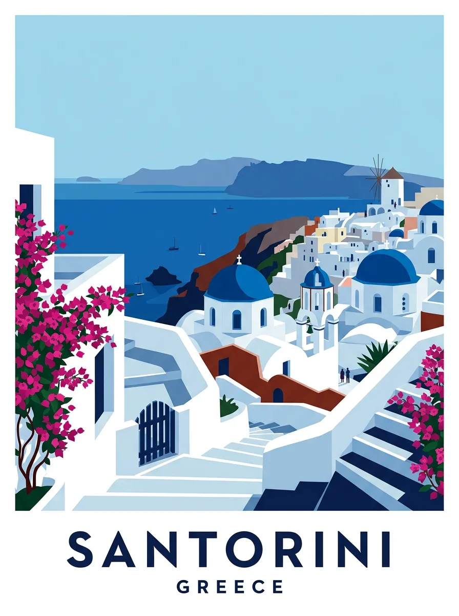
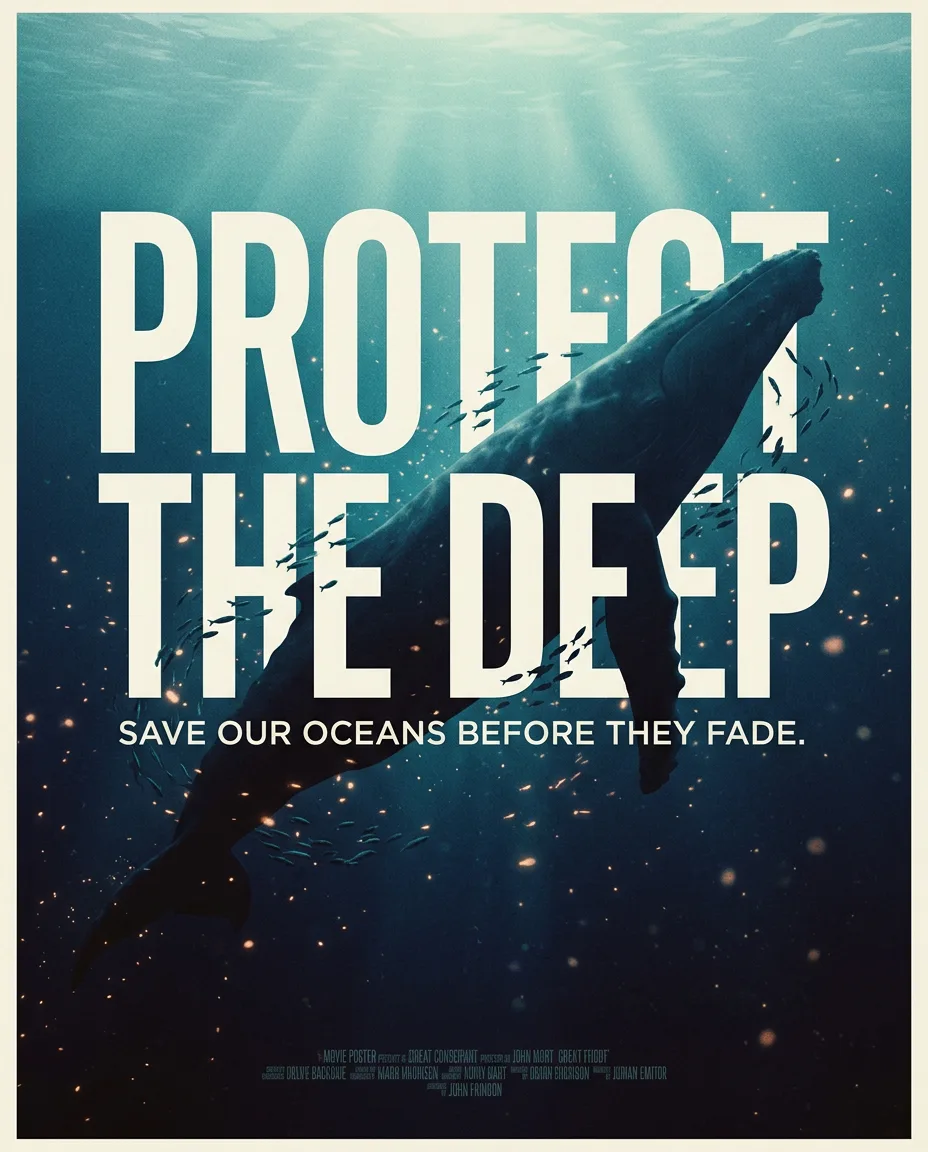
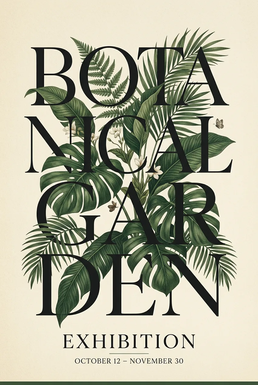
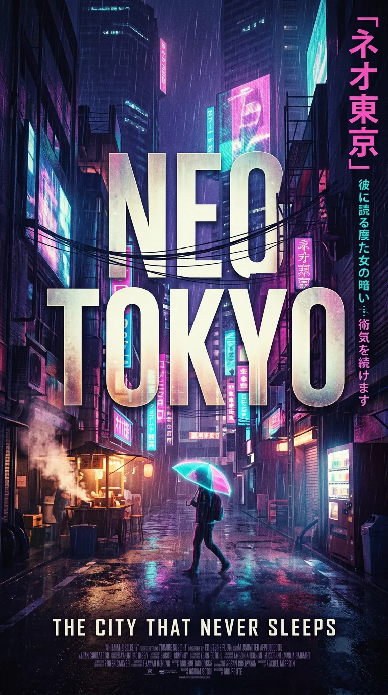
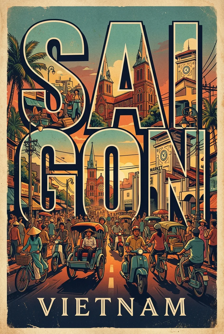
Santorini Editorial Travel Poster
프롬프트
Create a premium editorial travel poster illustration of Santorini. Automatically identify and depict the most iconic landmarks, architecture, geography, and visual identity associated with Santorini. Style: flat vector illustration, ultra clean minimalism, mid-century modern aesthetic, editorial travel poster style inspired by Scandinavian graphic design and vintage tourism prints, no photorealism, no textures, no noise, no gradients. Composition: vertical 3:4 poster layout. Foreground: a peaceful, characteristic ground-level scene unique to Santorini (paths, steps, local plants, or water as appropriate). Midground: the most recognizable architectural style and skyline elements of Santorini, with subtle silhouettes of people, local transport, and everyday life integrated naturally. Background: layered landscape or skyline of Santorini fading into the horizon, with 2–3 globally recognized landmarks of Santorini worked subtly into the scene. Architecture: simplified geometric rendering of Santorini's authentic architectural style, clean edges, balanced symmetry, flat color blocking. Color palette: a cohesive palette appropriate to Santorini's real-world visual identity. The base/background color must be pure, bright white (# FFFFFF) — strictly no yellow tint, no cream, no ivory, no off-white, no golden or beige-yellow hues anywhere in the image. Use clean whites only, paired with Santorini-appropriate accent colors (blues, greens, terracotta, navy, etc. as fits the location), bright yet restrained saturation. Lighting: bright daylight with soft, minimal shadows, fresh and clean atmosphere, calm and refined mood. Typography: add text at bottom center: "PLACE NAME IN CAPS" (large modern sans-serif, spaced lettering), with the country name as a small subtitle below. Mood: calm, elegant, premium travel-magazine aesthetic, timeless and culturally accurate to Santorini. Quality: ultra clean vector edges, perfect alignment and composition, high resolution, print-ready premium poster design. Negative prompt: no yellow, no beige-yellow, no sepia, no golden tones, no gradients, no texture noise The composition is a bold poster layout with a clear hierarchy: a dominant central image, a strong title in oversized type, and a single short supporting line, the elements arranged with generous negative space so the poster breathes. The grid is clean and editorial, the focal point unmistakable, the eye moving from title to image to detail in one confident sweep, the whole design feeling intentional and gallery-ready.
프롬프트 상세
| 최적 모델 | Nano Banana 2.1 |
| 화면 비율 | 3:4 |
| 상업적 이용 | 가능 — 결과물 라이선스는 사용하는 모델의 약관을 따릅니다 |
이 프롬프트가 효과적인 이유
Subject: Create a premium editorial travel poster illustration of Santorini. Composition: 3:4 frame with the subject as the clear focal point, layered foreground and background, and calm negative space guiding the eye. Lighting: Lighting is bold and graphic: strong directional light with crisp shadows, high contrast, the subject lit like a studio hero shot, the background a flat, confident color field.
프롬프트 사용법
- 프롬프트 복사
- 위에 표시된 모델 열기
- 생성하기
출처: PixAttic Studio(오리지널 항목). 수집 항목은 항상 원저작자를 여기에 표기하고 원본 게시물로 링크합니다. DMCA · 신고 또는 삭제 요청
Prompt adapted and expanded from @Naiknelofar788 · via PicGens. All images on this page were generated by PixAttic Studio using the prompt above.