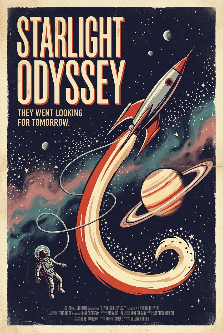

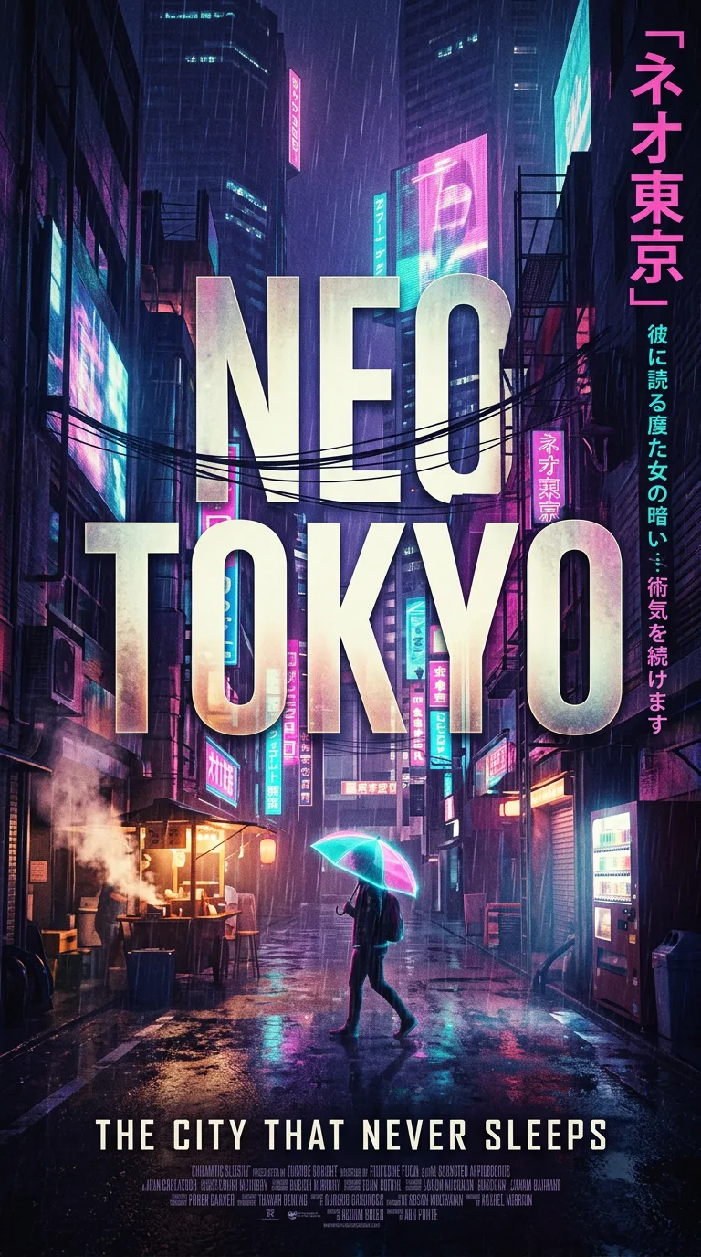
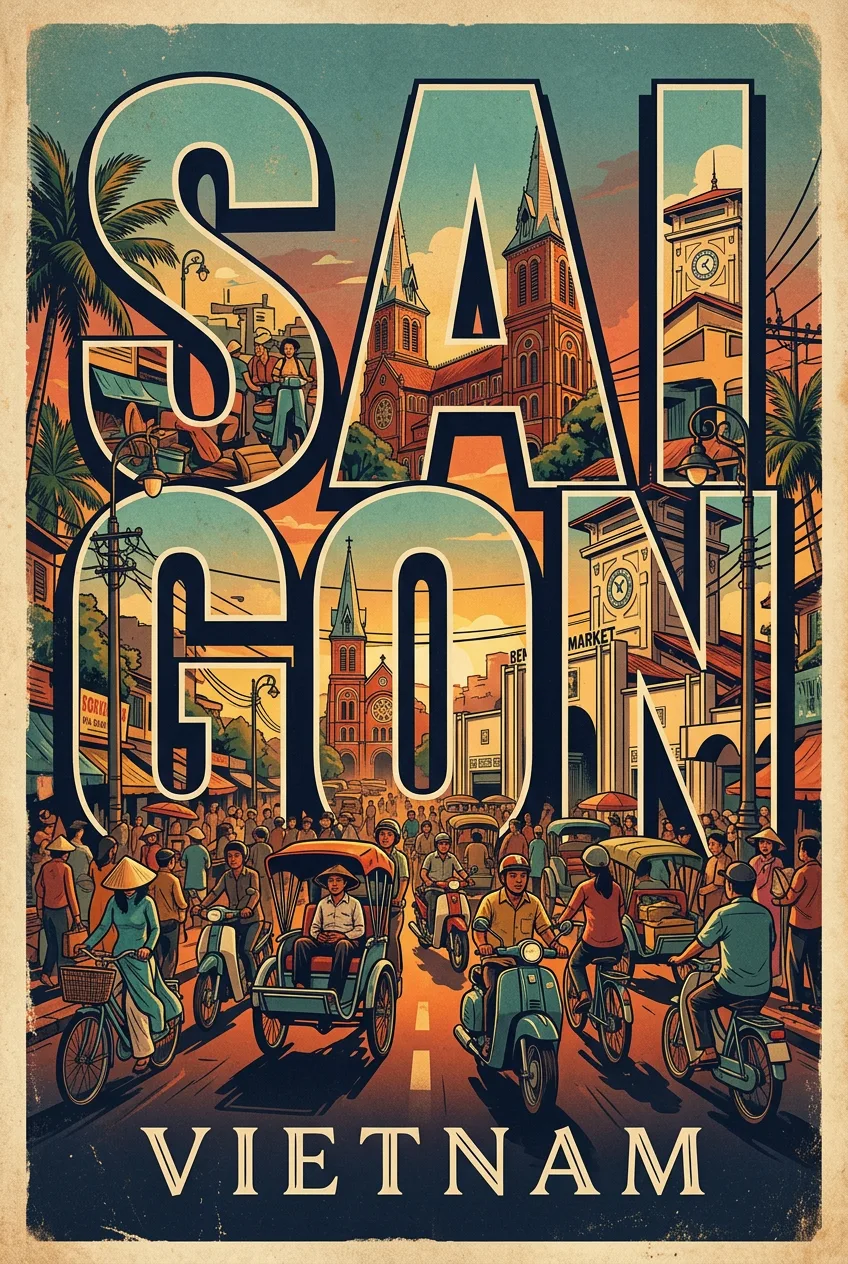
Starlight Odyssey Retro Movie Poster
프롬프트
A retro space opera movie poster in bold mid-century style, built around a single dramatic image: a rocket ship with swept fins climbing past a ringed planet, its exhaust trail curling into a plume of stars, while a tiny astronaut in a bubble helmet drifts in the foreground, tethered to the ship by a thin silver line. The starfield is dense and hand-painted, clusters of stars and two small moons, a nebula in faded rose and teal. The title reads STARLIGHT ODYSSEY in huge condensed capitals across the upper third, with a short tagline beneath it in smaller type: THEY WENT LOOKING FOR TOMORROW. The palette is deep indigo, warm cream, and rocket-red, the typography confident and slightly weathered, the whole poster glowing with the optimistic pulp energy of 1950s science fiction, printed with subtle paper grain. The design is a vintage-inflected graphic: A retro space opera movie poster in bold mid-century style, built around. Simplified shapes, limited palette, and confident typography carry the whole message, with texture and grain doing the work that detail would do in a photograph. The layout is balanced and unhurried: a strong central motif, generous negative space, and type placed with intent — a headline that can be read at a glance and small details that reward a closer look. Color is the lighting here: a restrained, era-true palette with one accent that pops, soft tonal transitions, and a warm, slightly faded finish that feels printed and aged rather than digital. The finish is tactile: risograph grain, offset misregistration, paper fiber, and hand-drawn imperfection. The mood is nostalgic and charming, a poster that feels found in a flea market and kept forever. Every detail is checked for believability: the title is short and readable, the supporting text is minimal, the colors stay in harmony, and nothing crowds the edges. The result is a poster worth pinning up and keeping.
프롬프트 상세
| 최적 모델 | Nano Banana 2.1 |
| 화면 비율 | 2:3 |
| 상업적 이용 | 가능 — 결과물 라이선스는 사용하는 모델의 약관을 따릅니다 |
이 프롬프트가 효과적인 이유
Subject: A retro space opera movie poster in bold mid-century style, built around, rendered with specific, countable detail rather than generic labels. Composition: classic poster grid with the hero image dominant, clear title hierarchy, and generous margins. Lighting: dramatic directional light with deep shadows and glowing highlights.
프롬프트 사용법
- 프롬프트 복사
- 위에 표시된 모델 열기
- 생성하기
출처: PixAttic Studio(오리지널 항목). 수집 항목은 항상 원저작자를 여기에 표기하고 원본 게시물로 링크합니다. DMCA · 신고 또는 삭제 요청
Original prompt and images by PixAttic Studio.