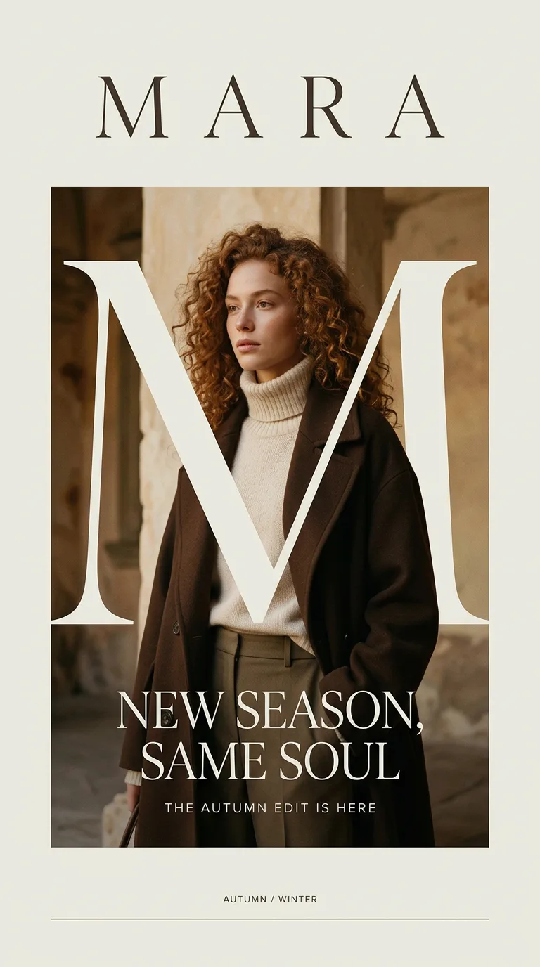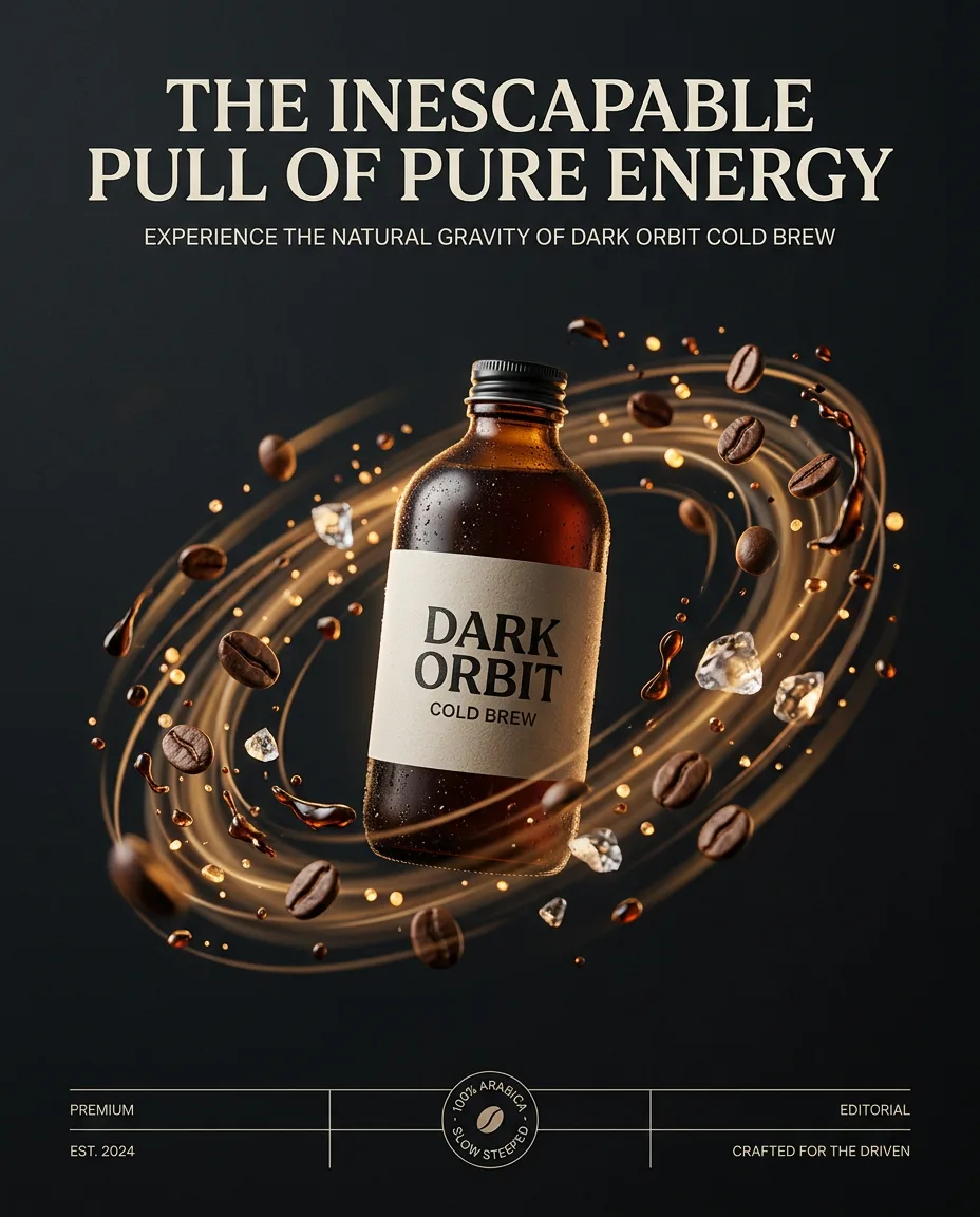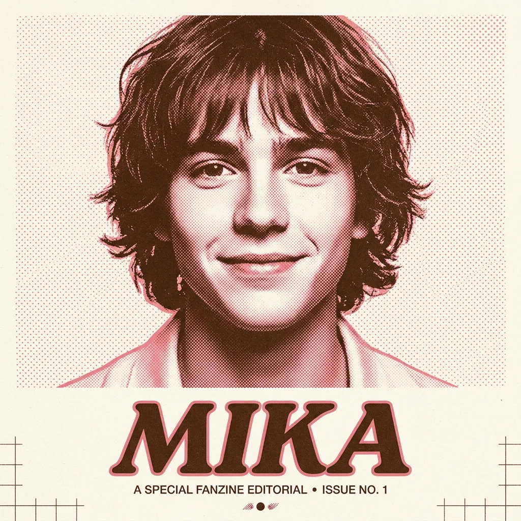
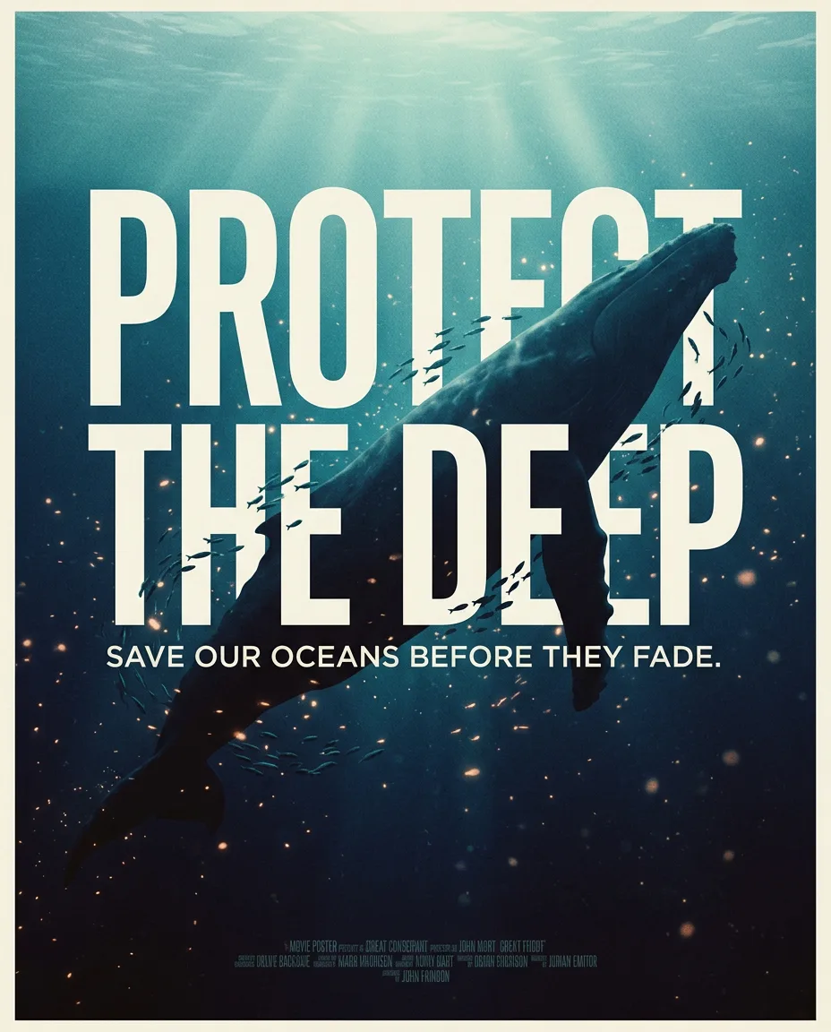
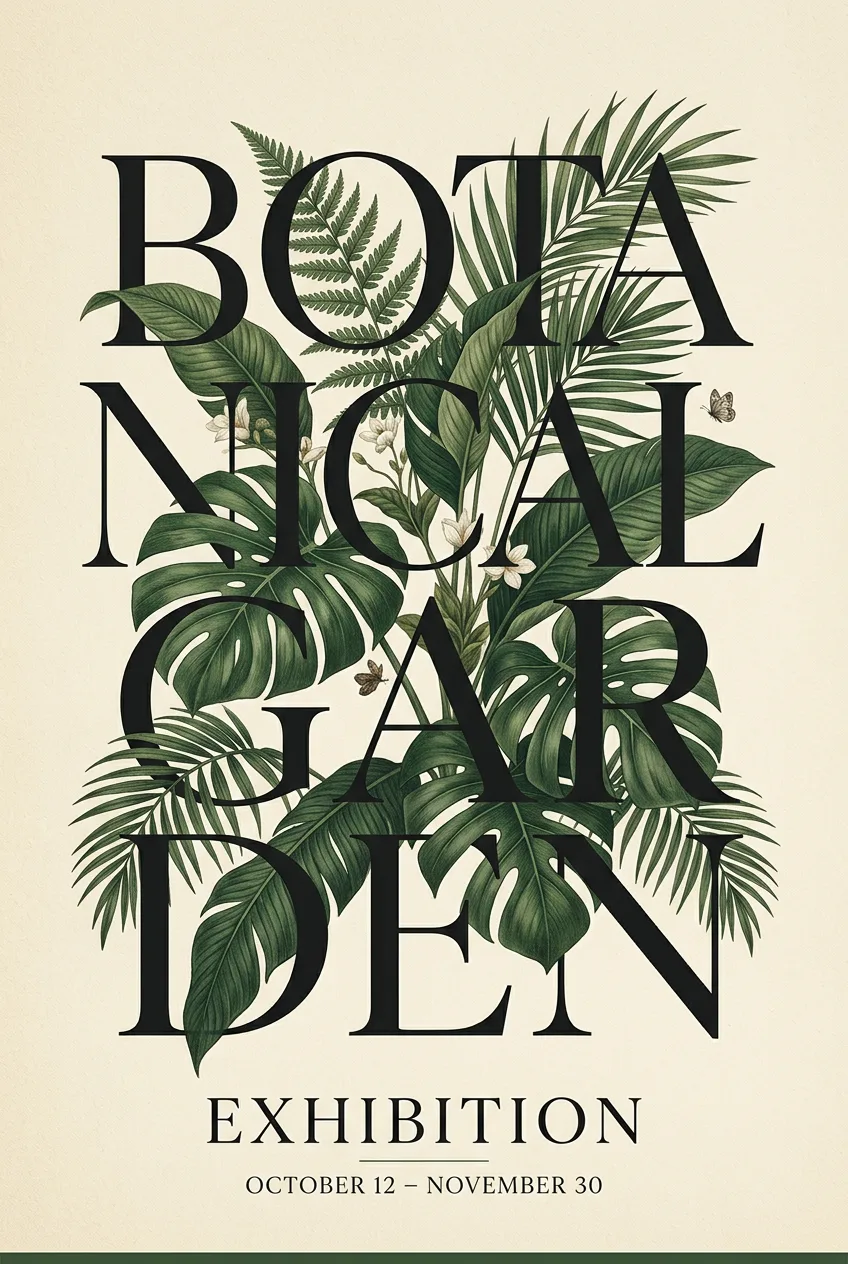
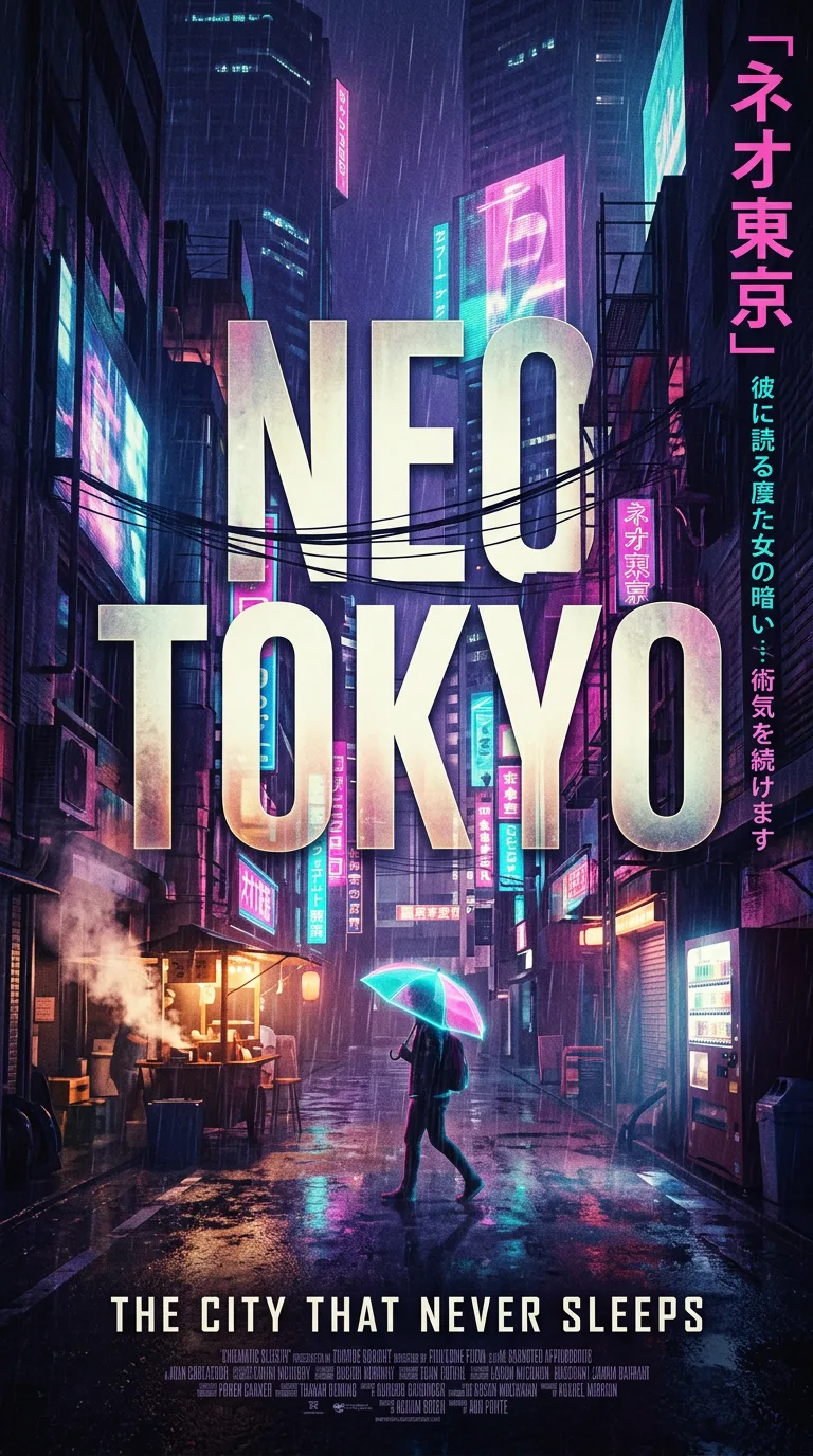
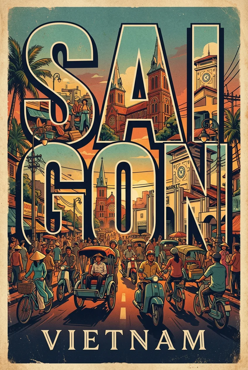
Fan Zine Editorial Poster Of Mika Tight Shoulder-Up
프롬프트
A fan zine editorial poster of Mika, tight shoulder-up crop — head and face fill 70-75% of the frame height, only the very top edge of shoulders and shirt collar barely visible at the bottom of the frame, the bottom of the poster cuts off exactly at the shoulder line, NO chest, NO torso visible, wearing a soft collar, facing forward, a gentle, warm smile. Rendered in halftone dot photographic style, duotone — warm brown ink bright and saturated but not neon, like classic risograph screen-print ink, NOT dark, NOT muted, NOT pale — a bold alive mid-tone soft rose, on off-white/cream paper texture. Subtle film grain and analog noise texture layered over the entire image, the grain is light and organic like a physically printed risograph zine, NOT heavy, NOT overwhelming — just enough to remove the digital cleanness and add tactile printed paper feel throughout. CRITICAL — background extends fully to all four edges and corners of the image with zero white border or margin, no padding, no frame, no white edge — the halftone dot texture fills the entire canvas edge-to-edge. Composition: a 1:1 poster layout with a clear hierarchy — one dominant image in the upper two-thirds, a strong title below it, and a small line of supporting text at the bottom. Generous margins and white space keep the page breathing, and every element aligns to a simple grid. Lighting: the hero image carries a single strong light direction, giving it depth and drama, while the poster background stays flat and even so the text remains perfectly legible. Highlights are controlled, shadows are open, and the overall impression is polished and print-ready. Materials and mood: a premium paper feel with a subtle matte texture, inks that sit rich and flat, and a color palette limited to three or four tones that work together. The mood is confident and collectible, the kind of poster that looks equally good framed on a wall or shared on a phone. Style anchor: museum-quality editorial poster design — generous white space, a clear hierarchy, and one strong image carrying the page.
프롬프트 상세
| 최적 모델 | Nano Banana 2.1 |
| 화면 비율 | 1:1 |
| 상업적 이용 | 가능 — 결과물 라이선스는 사용하는 모델의 약관을 따릅니다 |
이 프롬프트가 효과적인 이유
Subject: A fan zine editorial poster of Mika, tight shoulder-up crop — head and face fill 70-75% of the frame height, only the very top edge of shoulders and. Composition: a 1:1 poster layout with one dominant image, a strong title, and generous white space. Lighting: clean, even light across the page with the hero image lit to match its mood.
프롬프트 사용법
- 프롬프트 복사
- 위에 표시된 모델 열기
- 생성하기
출처: PixAttic Studio(오리지널 항목). 수집 항목은 항상 원저작자를 여기에 표기하고 원본 게시물로 링크합니다. DMCA · 신고 또는 삭제 요청
Prompt adapted and expanded from @Arminn_Ai · via PicGens. All images on this page were generated by PixAttic Studio using the prompt above.