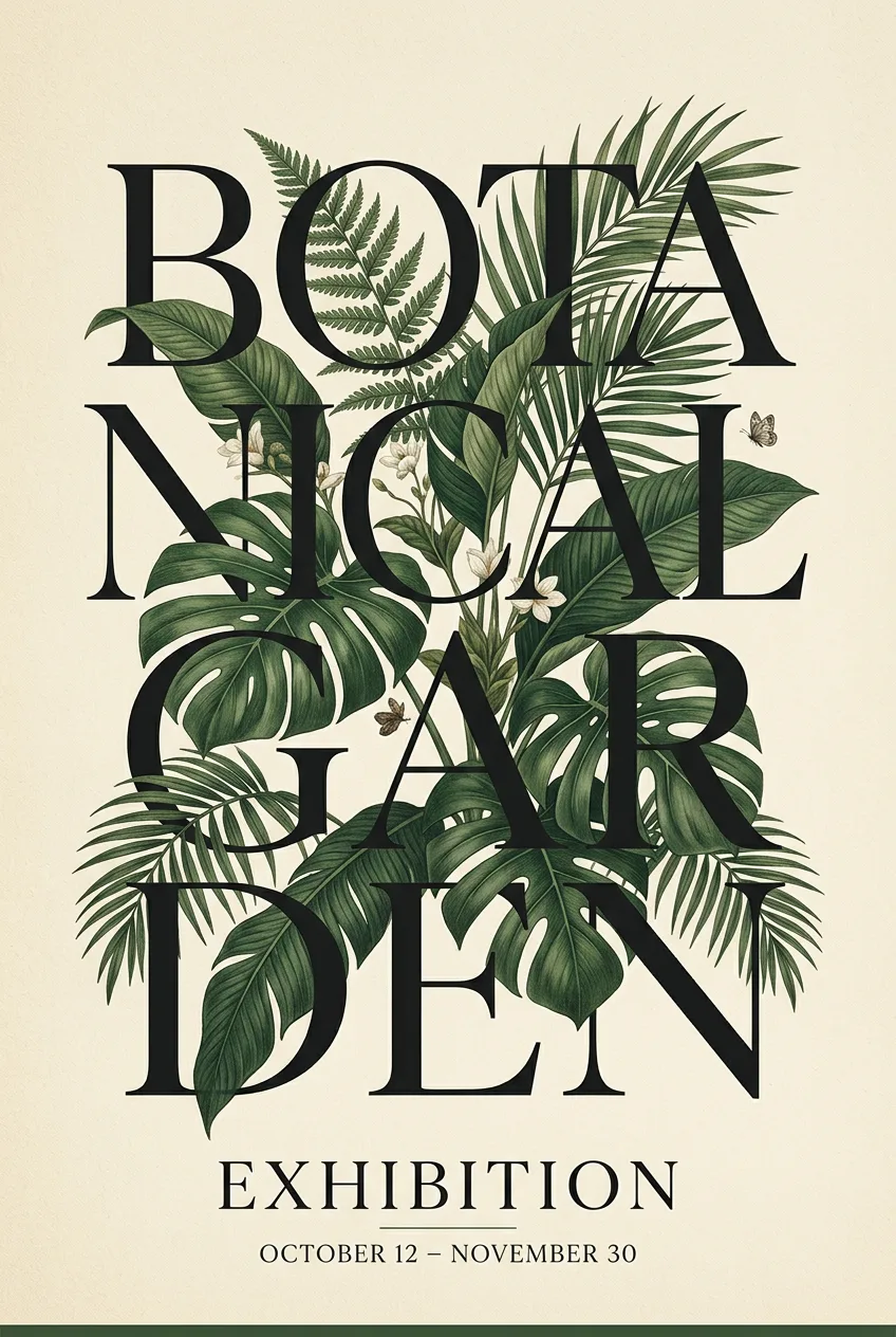
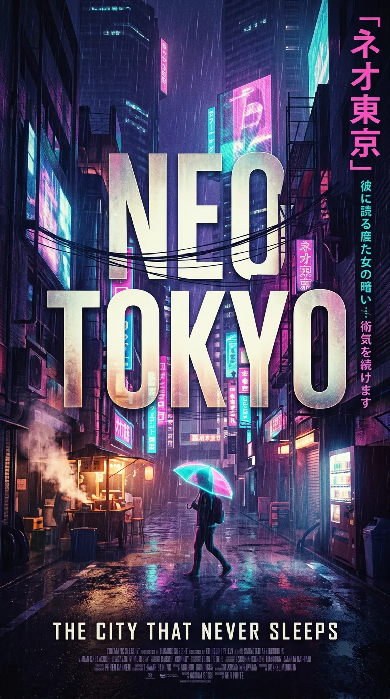
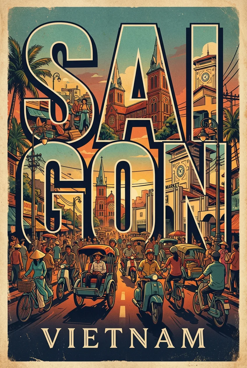
Product Has Gravity Advertising Poster For A Bottle
프롬프트
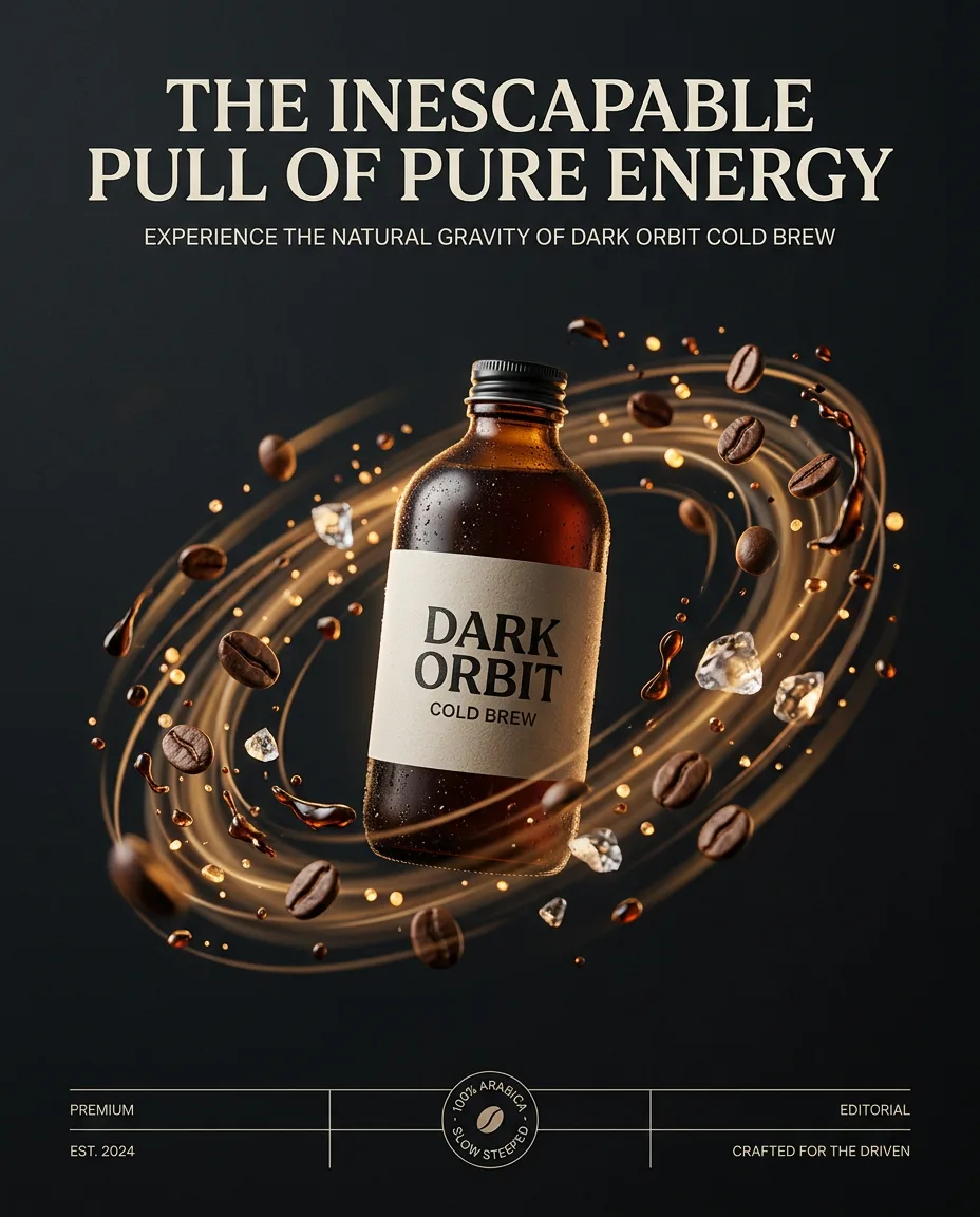
Create a premium PRODUCT HAS GRAVITY advertising poster for a bottle of cold brew coffee on a clean editorial background. Place the authentic photorealistic product floating at the visual center as a powerful gravitational force, pulling product-relevant objects, particles, light, energy and typography into dramatic curved trajectories around it. Build a realistic spatial vortex with warped perspective, radial motion trails and bent environmental elements, while keeping the hero product perfectly sharp, undistorted and dominant. Create a short, bold campaign headline specifically based on the product's main benefit, expressed through a gravity, orbit, pull, force, mass or attraction metaphor; never use a fixed generic gravity headline. Surrounding objects must directly relate to the product's real use case and visually reinforce its benefit. Use controlled brand-color accents, cinematic commercial lighting, realistic physics, strong depth, generous negative space and premium global advertising art direction; surreal yet believable, sophisticated, minimal, high-impact, no irrelevant objects, no clutter. Composition: a 4:5 editorial layout with the hero image anchoring the center, a bold title set in generous letter-spacing, and supporting elements — a small badge, a date line, a thin rule — placed with restraint. The grid is simple, the balance is calm, and the eye moves from image to title to detail in one smooth pass. Lighting: clean, even light across the poster surface, with the hero image itself lit to match its mood — warm and golden for a nostalgic piece, cool and crisp for a modern one. Shadows inside the image are soft and intentional, and nothing in the lighting fights the typography. Materials and mood: a premium paper feel with a subtle matte texture, inks that sit rich and flat, and a color palette limited to three or four tones that work together. The mood is confident and collectible, the kind of poster that looks equally good framed on a wall or shared on a phone. Style anchor: museum-quality editorial poster design — generous white space, a clear hierarchy, and one strong image carrying the page.
프롬프트 상세
| 최적 모델 | Nano Banana 2.1 |
| 화면 비율 | 4:5 |
| 상업적 이용 | 가능 — 결과물 라이선스는 사용하는 모델의 약관을 따릅니다 |
이 프롬프트가 효과적인 이유
Subject: Create a premium PRODUCT HAS GRAVITY advertising poster for a bottle of cold brew coffee on a clean editorial background. Composition: a 4:5 poster layout with one dominant image, a strong title, and generous white space. Lighting: clean, even light across the page with the hero image lit to match its mood.
프롬프트 사용법
- 프롬프트 복사
- 위에 표시된 모델 열기
- 생성하기
출처: PixAttic Studio(오리지널 항목). 수집 항목은 항상 원저작자를 여기에 표기하고 원본 게시물로 링크합니다. DMCA · 신고 또는 삭제 요청
Prompt adapted and expanded from @Goodmanprotocol · via PicGens. All images on this page were generated by PixAttic Studio using the prompt above.